A GIF of Cosmocloud API builder interface. There is a tree like structure with start and stop ends. The user clicks on "Add node" to select a type of node to add and then drag it to an appropriate position in the tree structure.

Design systems

Stakeholder management

B2B software design

Cosmocloud

Cosmocloud

Boosted developer productivity by 10x through optimized backend workflows.

Timeline

12 weeks

Team

Product Designer, Project Manager, 3 Developers

My role

Product Designer

Tools

Figma, JIRA, Rive

In a nutshell

A confused stick figure looking at Multiple boxes that look like code snippets with text written as "Too many backend languages and frameworks"
A tree-like chart with shapes like circle and rounded rectangles with text written as "Simplified setup with drag & drop"
A confused stick figure with though bubble of "???" and a pink rectangular box along with an incomplete tree chart. The text says "Low engageement and user confusion"
A hand-drawn icon of a user in front of a laptop screen with another user inside the screen with text written as "Inteviewed 5 developers"
A color coded legend with small rectangles under each color tab along with a tree-chart with multiple colors. The text says "Reusable components of different categories"
Three happy stick figures raising their hands to celebrate. The text says "Users can create backend in 10 minutes"

Impact

x10

productivity in designing backend

↓13%

drop-off rate

↑18%

User engagement

↓38%

coding time for Cosmocloud developers

Background

Software development is complex and frustrating with the ever-evolving frameworks and a need to keep switching between them.

Backend developers today juggle constantly evolving tech stacks, endless documentation, and the complexity of microservice-based architectures. Cosmocloud aimed to simplify this chaos by offering a GUI-driven way to build, visualize, and deploy backend systems using modular logic blocks. As a Product Designer, my role was to transform that vision into an intuitive interface developers would actually want to use.

Cosmocloud's solution: Simplify backend development allowing users to visualize APIs with a drag-and-drop interface instead of writing code.

But first, what's an API?

An API is a messenger that helps apps share information, like a waiter delivering your order between you and the kitchen!

A simple diagram with three black icons and labels in a horizontal line. From left to right: a person icon labeled "User", a two-way arrow icon labeled "API", and a stacked cylinder icon labeled "Database". The layout suggests a typical interaction flow where the user communicates with the database through the API.

Problem statement

The real challenge: A product with potential, but no clarity

Despite offering a no-code solution, users were dropping off. My goal was to understand WHY and design a more engaging, easy-to-use experience.

Screenshot of a web interface displaying details with labels, data fields, and a flowchart-like graphic.

Stakeholder prompt

Increase user engagement of the drag-and-drop API builder

Discovery

What I uncovered from talking to engineers…

I started by talking to 5 developers—some experienced, some new to backend development—to uncover their frustrations while using Cosmocloud's API builder.

Primary issues with the platform

Didn't understand where to start

Complicated flows become too much information

Primary issues with the platform

Didn't understand where to start

Complicated flows become too much information

Primary issues with the platform

Didn't understand where to start

Complicated flows become too much information

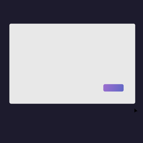
Breaking down the current design

The platform wasn’t as simple as it seemed—especially for new developers

The current design featured a single card used for multiple functions, creating confusion and hindering understanding, particularly for non-developers.

Screenshot of the API builder interface with part of the tree-chart focused and labeled "Hard to tell apart"

Design process

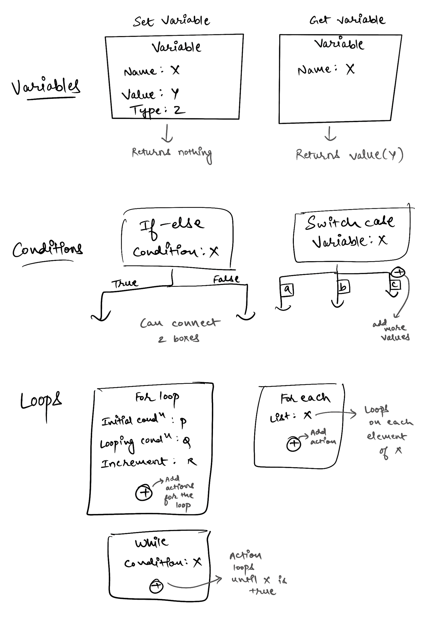
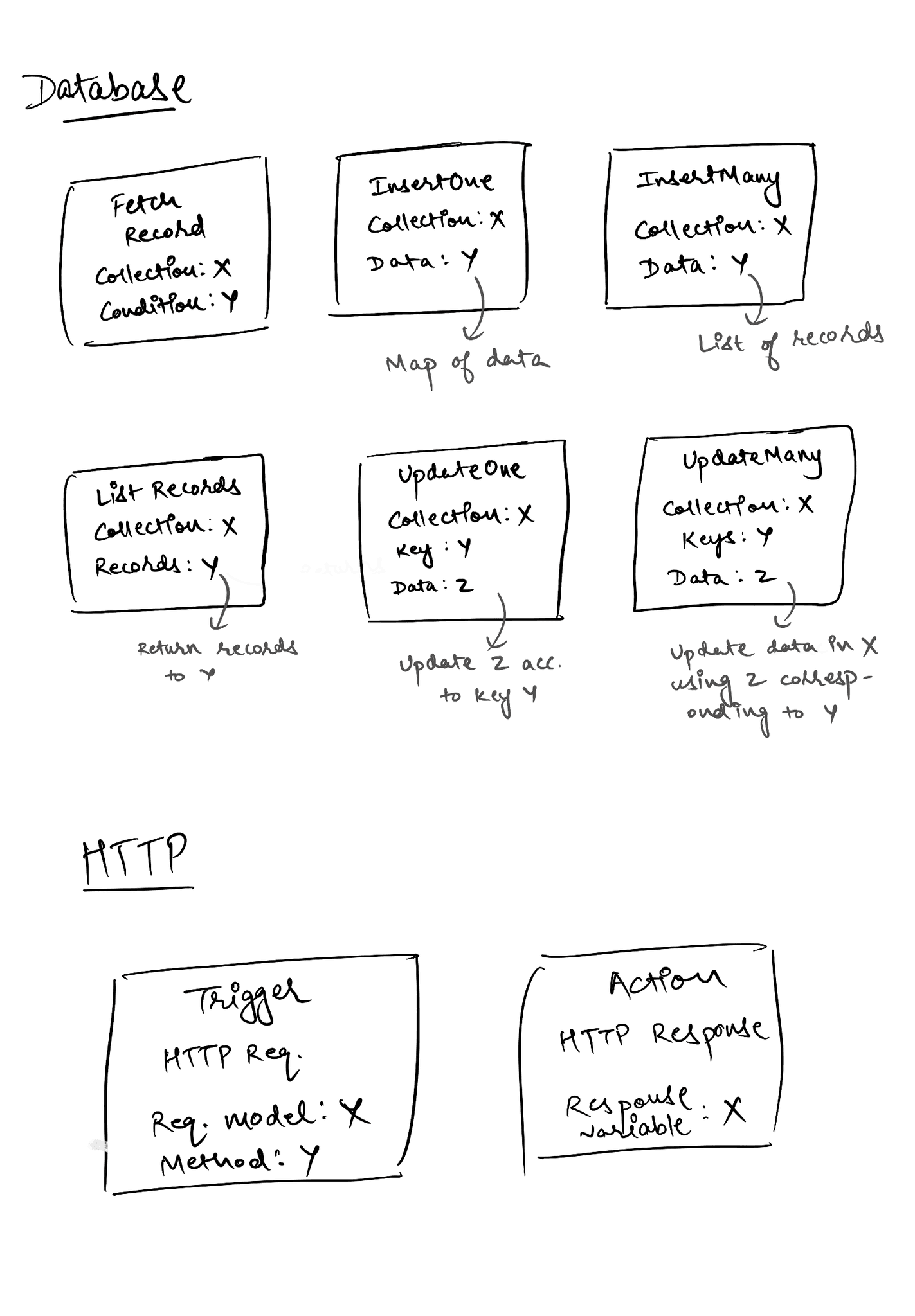
Identifying the components of the backend system

Researched and sketched key backend components developers need.

Leveraging my technical background, I researched essential functionalities that users would need for backend creation. I also brainstormed the components with the developers in my team to get a deeper understanding.

A series of hand-drawn sketches with various labeled diagrams and text representing cards/components of the code.

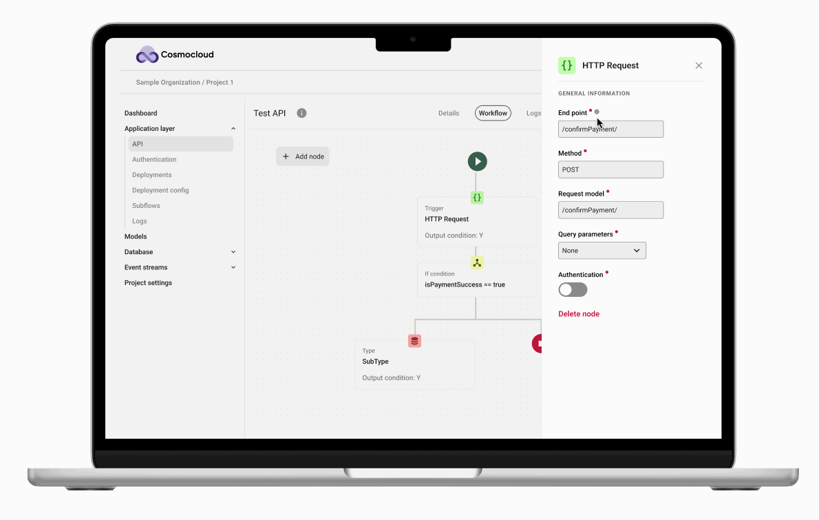
Restructuring the Interface for Clarity

Grouped components into 5 clear categories

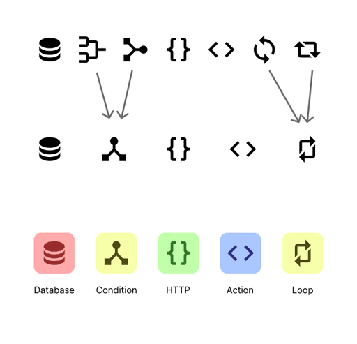
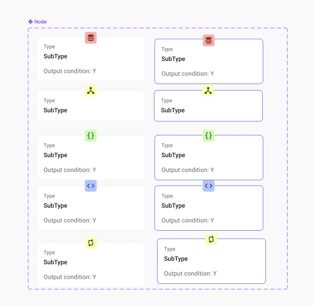
While designing the cards for different elements, I started noticing patterns and similarities between some of them. This led me to group related features into 5 clear categories. It helped simplify the interface, so users could quickly find what they needed without feeling overwhelmed by clutter.

Organized component diagrams in 3 groups: Variables, conditions and loops.
Organized component diagrams in 2 groups: Database and HTTP

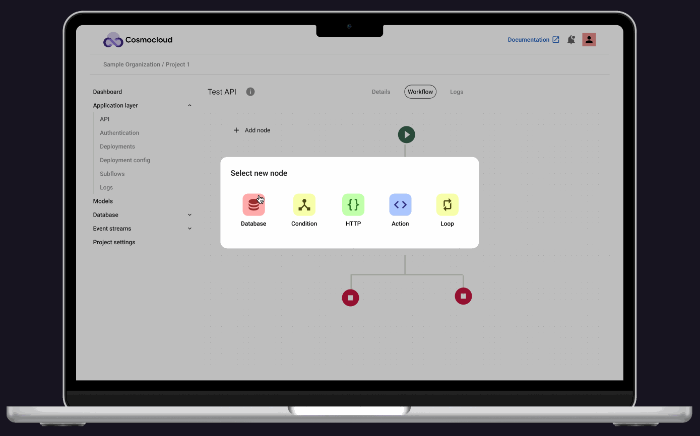
Design system and prototyping

Designed intuitive cards with meaningful icons and colors

I then moved to Figma to design the components for these elements.

Card design progress. The left card represents the old design. The center set of cards represent the rejected ideas and the right card represents the final redesign.

This included designing cards, finding icons and deciding the colors and laying out the design system for the canvas.

Diagram showing icon updates for a workflow system. Top row has older icons; bottom row shows updated versions. Gray arrows indicate changes. Legend below labels: Database (red), Condition (yellow), HTTP (green), Action (blue), Loop (yellow).
Screenshot of the "Node" component in the design system in Figma. The component has 10 variants.

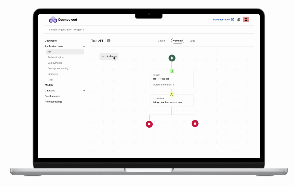
The final step was prototyping the API builder canvas - turning our conceptual designs into a working, interactive experience that would fundamentally change how backend systems are created.

A GIF of Cosmocloud API builder interface. There is a tree like structure with start and stop ends. The user clicks on "Add node" to select a type of node to add and then drag it to an appropriate position in the tree structure.

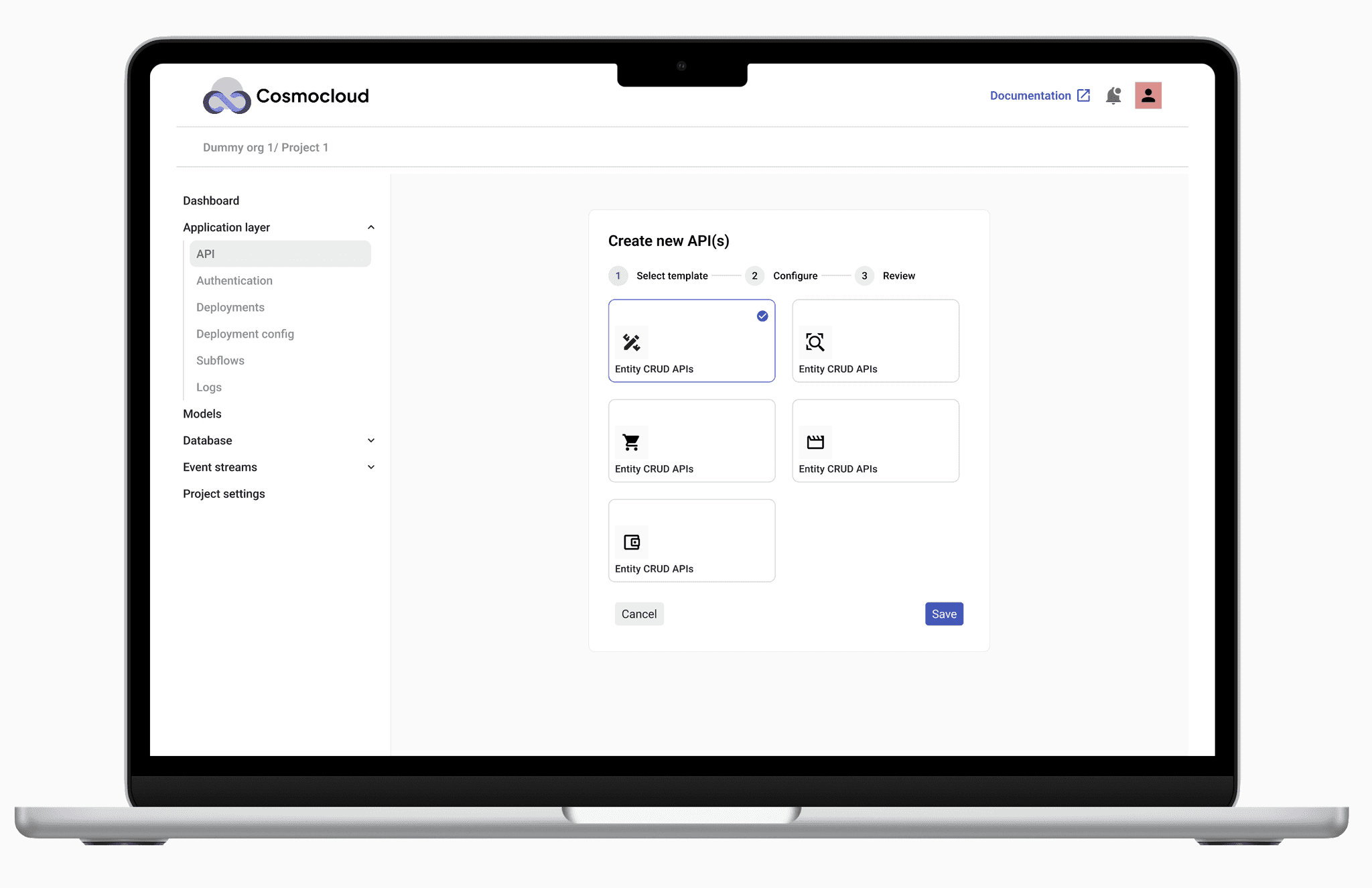
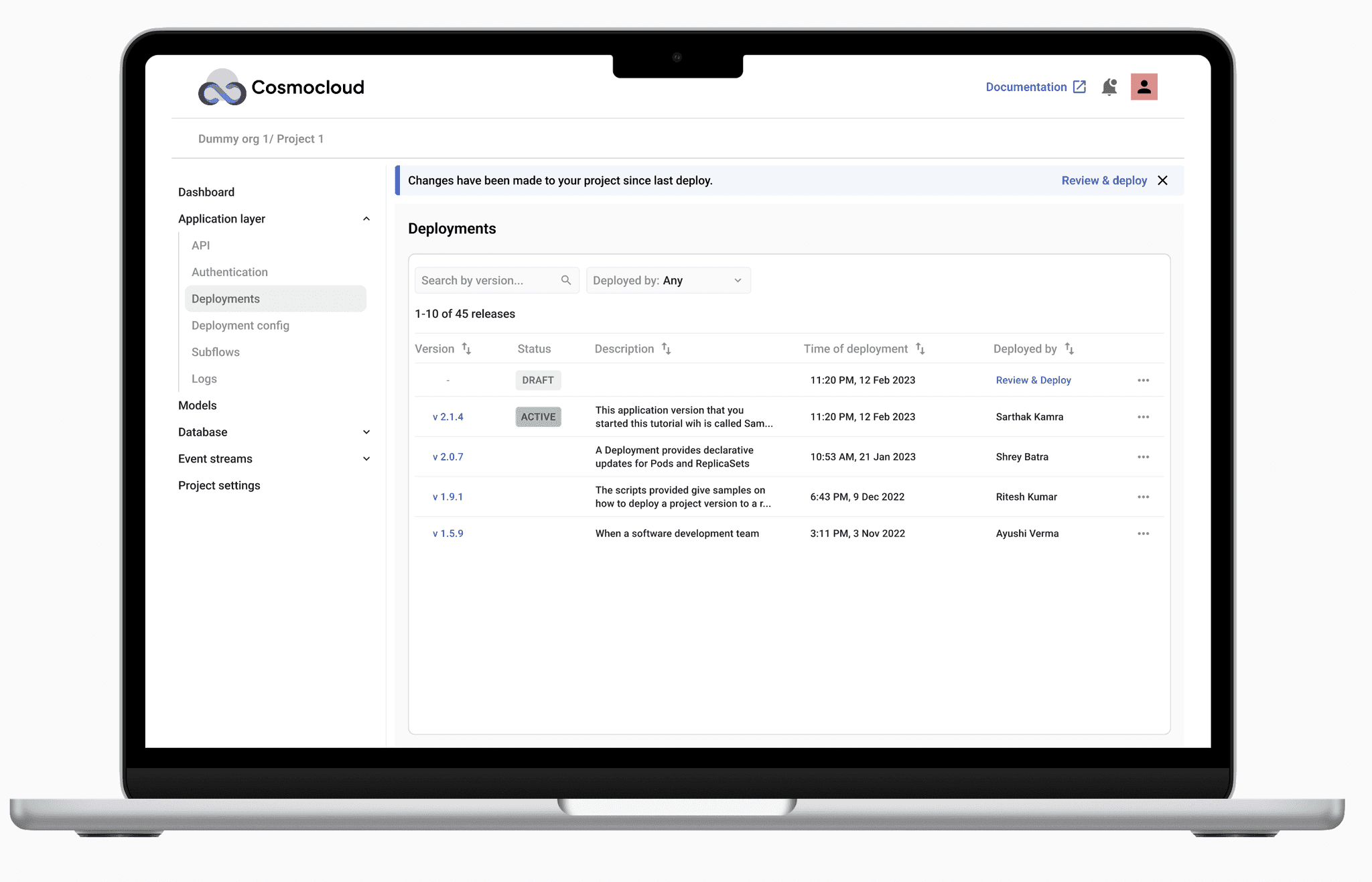
Expanding the Solution: Templates and deployment screens

Designed and prototyped the other aspects of a backend system like deployment screens.

Just like a concert poster needs distribution, our API builder needed complementary features. I designed and prototyped additional screens to create a comprehensive end-to-end backend development solution.

Laptop screen displaying the Cosmocloud interface. The screen shows a form for creating new APIs with multiple “Entity CRUD APIs” template options and a step progress bar (Select template, Configure, Review). The sidebar on the left lists menu items under Application layer, Models, and Event streams.
Laptop screen showing the "Deployments" section of the Cosmocloud dashboard. A notification bar at the top indicates changes since the last deployment. The main panel lists versions, statuses (e.g., DRAFT, ACTIVE), deployment descriptions, timestamps, and deployer names. The sidebar highlights "Deployments" under the Application layer.

Documentation and design hand-off

Created documentation for easy understanding of fonts, colors and components used along with description of use cases for each.

I documented the elements used in the design system and handed them over to the developers in the form of JSON files to maintain consistency.

Impact

x10

productivity in designing backend

x10

productivity in designing backend

x10

productivity in designing backend

↑18%

increased engagement

↑18%

increased engagement

↑18%

increased engagement

↓13%

drop-off rate

↓13%

drop-off rate

↓13%

drop-off rate

↓38%

coding time for developers

↓38%

coding time for developers

↓38%

coding time for developers

  • Users can code backend within 15 minutes by simply dragging and dropping elements, making the process 10 times more productive.

  • The intuitive layout of cards increased user understanding of the platform and reduced the drop-off rate by 13%.

Thanks to Cosmocloud, we slashed our development time from 3 days to a mere 3 hours!

Head of Engineering

A well established tech firm

Thanks to Cosmocloud, we slashed our development time from 3 days to a mere 3 hours!

Head of Engineering

A well established tech firm

Thanks to Cosmocloud, we slashed our development time from 3 days to a mere 3 hours!

Head of Engineering

A well established tech firm

Learnings and outcomes

  • Collaboration is Key
    Working closely with developers taught me the importance of cross-disciplinary teamwork in achieving a shared vision.

  • Simplicity in Complexity
    Stripping down complex backend processes into intuitive drag-and-drop components reinforced the value of simplicity in design.


  • Prototyping Iteration
    Rapid prototyping and testing allowed for quick adjustments, demonstrating the effectiveness of an agile design approach.

Bonus work: Elevating brand identity

In addition to my core responsibilities, I had the opportunity to contribute to Cosmocloud’s visual identity and public-facing website. While not a primary focus of my role, this allowed me to apply my design skills in a broader context.

Logo design

Iteratively designed a logo to align with brand identity.

Cosmocloud old logo
Cosmocloud old logo
Cosmocloud old logo
Cosmocloud updated logo
Cosmocloud final logo

Website design

Designed company website along with interactive animations designed in Rive.

I designed the company's public website, including landing pages, animations for product overviews, and a pricing page informed by competitive research.

Animations

To enhance user understanding, I created animations in Rive. These animations were converted into GIFs to visually explain the app's functionality, making it easier for users to grasp the concept.

GIF animation representing a form selection screen
GIF representing a flow-chart
GIF with user clicking on a purple button and a green check mark appearing on the screen.

To summarize

Successfully delivered designs for a no-code backend service platform reducing user drop off rate by 13%.

Throughout my time at Cosmocloud, I successfully redesigned the no-code backend platform to be more intuitive and user-friendly. My contributions not only simplified the user experience but also significantly impacted the efficiency of both developers and end-users, demonstrating the power of user-centered design in achieving business objectives.