In a nutshell

What’s lacking in current apps?
They’re not up to date!
Not interactive!
Difficult to filter events I like
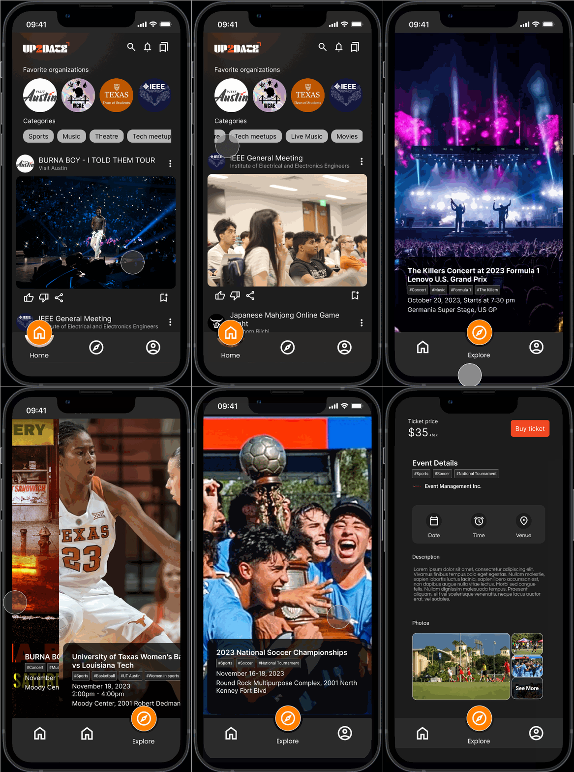
Find a match for your type of event!
Ideation:
8.8/10
user satisfaction rating

Impact
3
24%
increase in user satisfaction
8.8
Problem definition
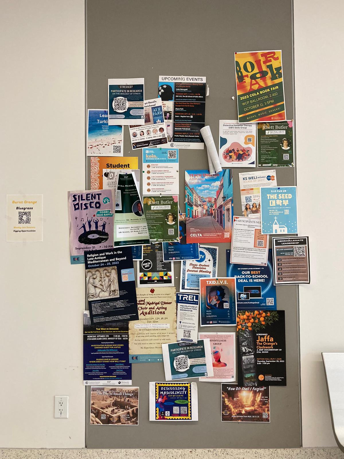
Bulletin boards are ineffective in delivering up-to-date information
The existing bulletin board and event posting stations on the University of Texas campus are ineffective in delivering up-to-date information due to outdated, damaged, or overlapping flyers, and their inconspicuous nature, leading to a need for a more efficient and user-friendly solution to promote campus events and activities.
User research
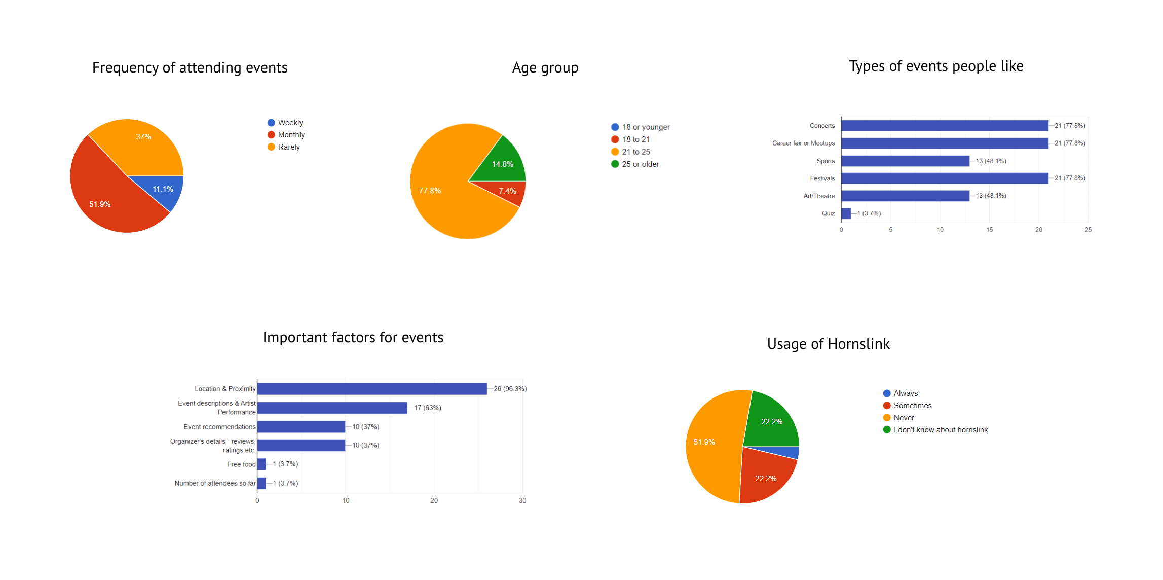
Conducted a survey across the campus that received 33 responses
The team conducted a survey to understand the means of communication the current event organizers were using to market their events. A Google Form was circulated among school groups, which received 33 responses.
People want personalized curation of a list of events.
No centralized platform for multiple events - it makes it hard to navigate through multiple platforms.
The usual way of communicating about college events is through social media platforms instead of the official college website.
Competitive analysis
Studied 4 competitor apps
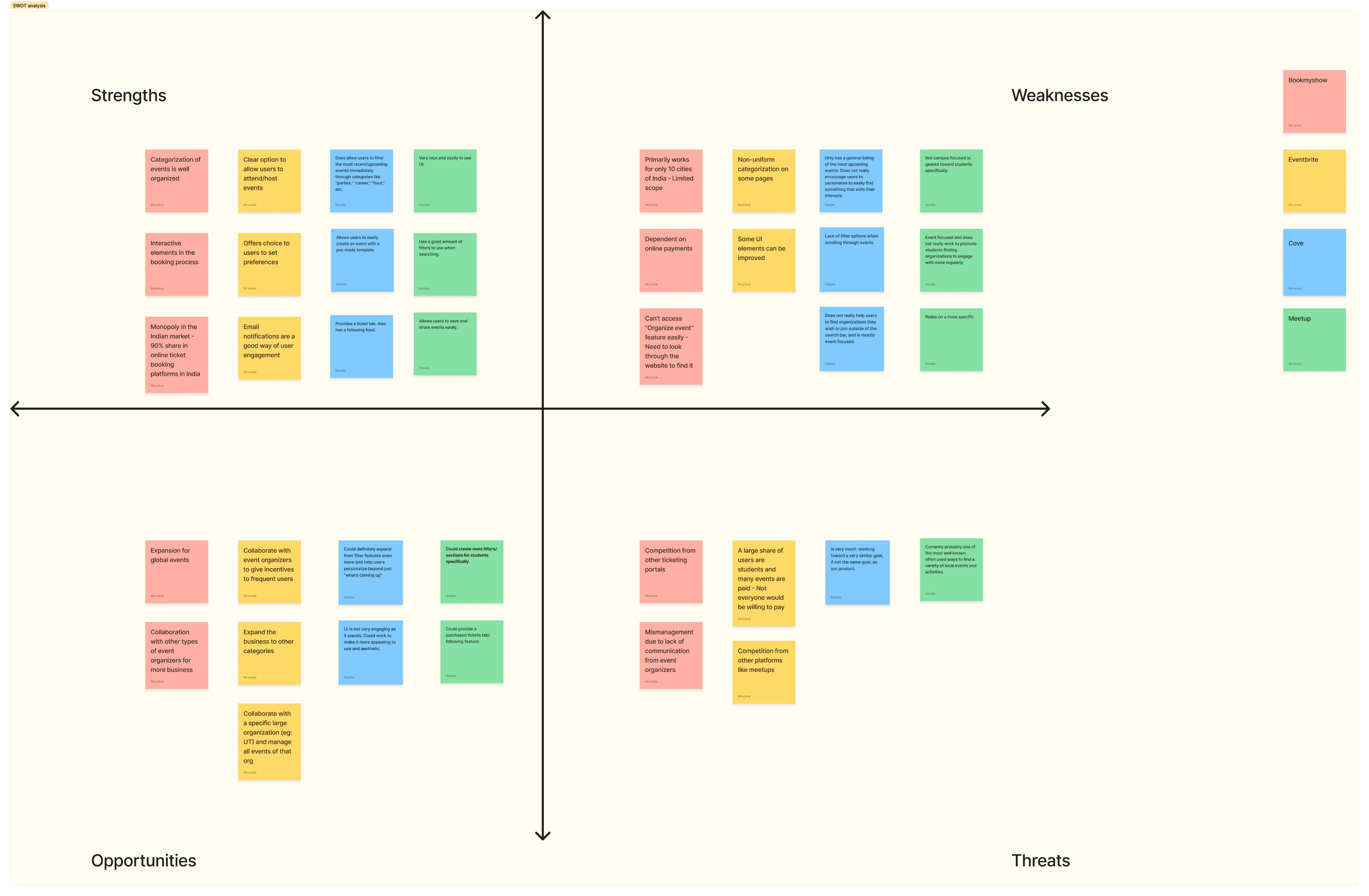
We then explored the existing solutions and performed a SWOT analysis on 4 competitors:
Eventbrite
Cove
Meetup
BookMyShow
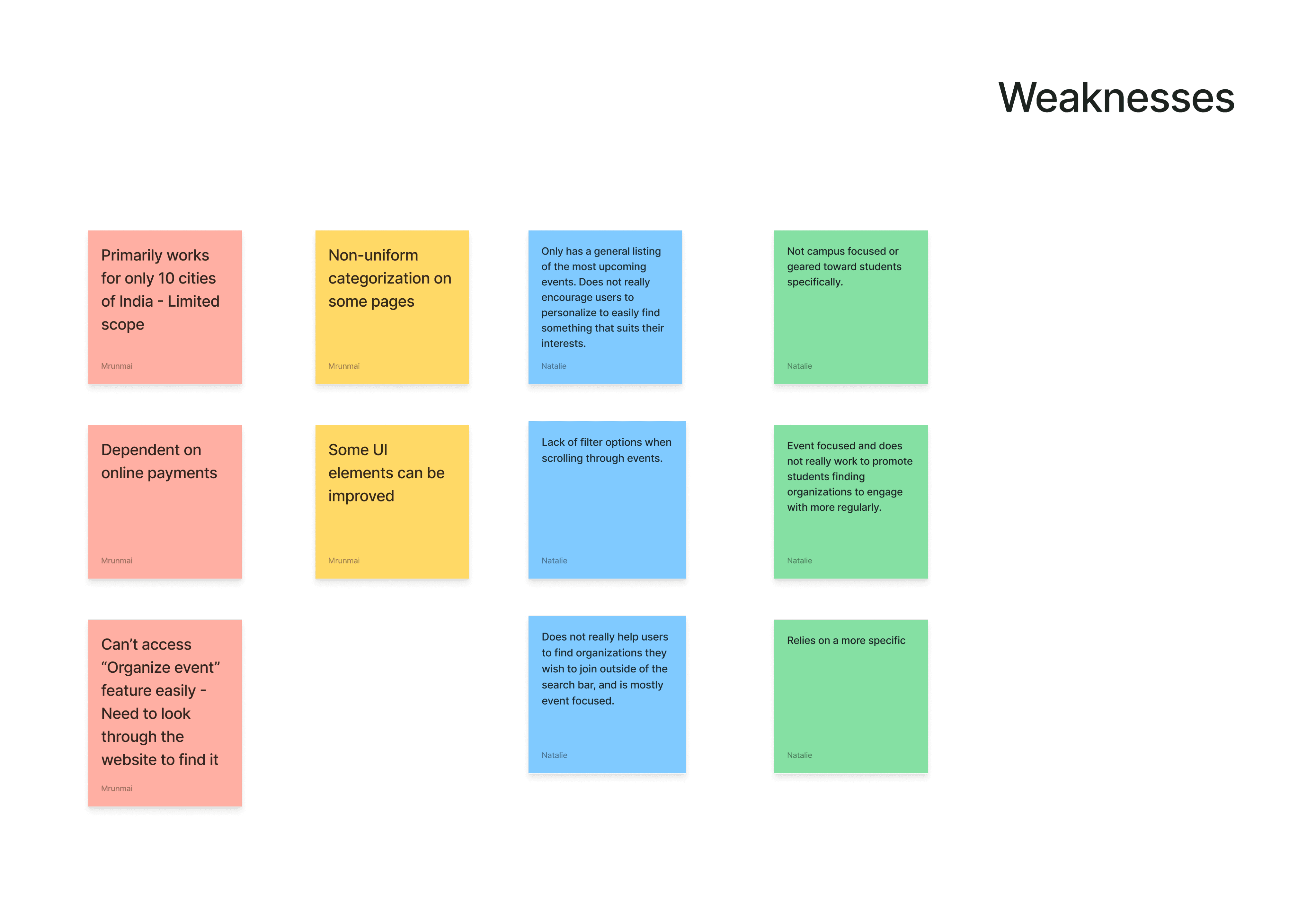
The apps had limited scope when considering events - focusing on one or some categories.
The apps gave generic results and were not up-to-date.
No unified platform for event attendees and organizers.
Ideation
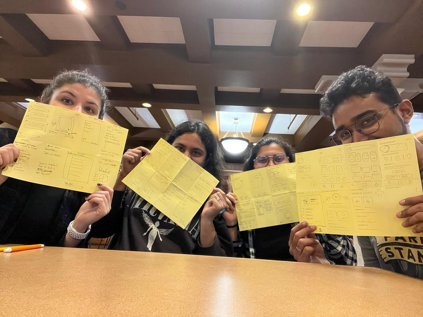
Performed crazy 8's to design the solution - A unified platform to browse through events
A need for a unified platform that is up-to-date and interactive was identified. The team proposed a mobile application to help students browse through events happening on and around campus.
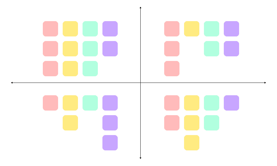
Brainstorming
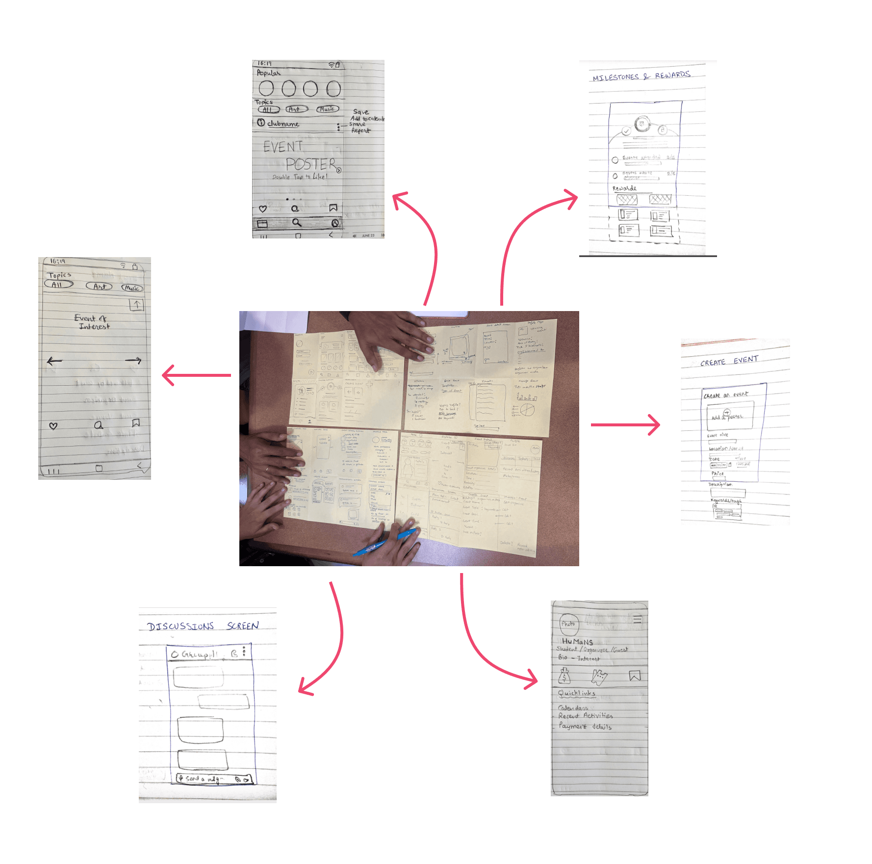
With a rough idea of the problem at hand, we started sketching 8 screens in 8 minutes and later picked ideas from each one of our sketches to design a low-fidelity sketch.
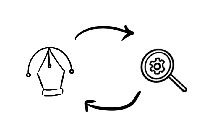
The iterative design process
Low-fidelity designs
Designed low-fidelity designs and tested with 3 users.
The first low-fi designs were prototyped on Figma and tested with three users.
User testing: Stage 1
The results of the first round of testing were surprising. The test results indicated that the designs had a lot of improvements and there were many things that were not intuitive from the user’s perspective.
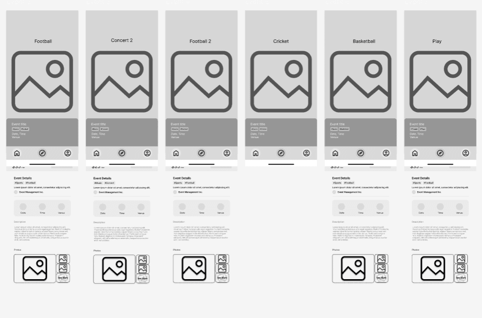
Mid-fidelity designs
Iterated on inputs from testing and designed mid-fi with refined interactions.
We modified the low-fi designs based on inputs from the users and a more interactive mid-fi version was designed and prototyped using Figma.
User testing: Stage 2
On understanding the primary concerns of users, the team tried designing with a more user-centric approach and it yielded better results.
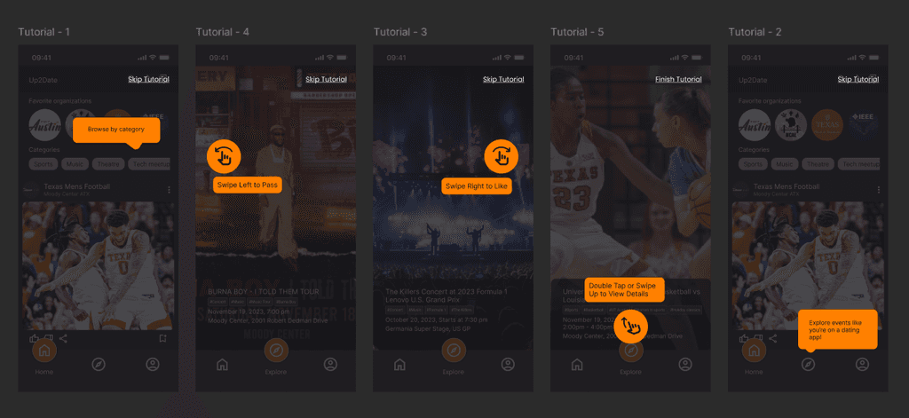
The users pointed out certain difficulties in understanding the app without a tutorial, which stood out as a problem to be solved.
High-fidelity designs
Designed an interactive and attractive high-fidelity prototype
On conducting two rounds of testing on the mid-fi, the good and bad aspects of the prototype were identified. We further designed a hi-fi version with modifications that were visually appealing and intuitive to use.
We then updated the designs to be more intuitive and tested again. The hi-fi prototype was more understandable and intuitive than the previous versions.
Minor design changes were done before presenting the final prototype.
User testing: Stage 3
How did testing help us?
Three rounds of testing using UserTesting helped understand user pain points easily.
We used the UserTesting platform to get the prototype reviewed. Additionally, we also conducted in-person testing for better inputs.
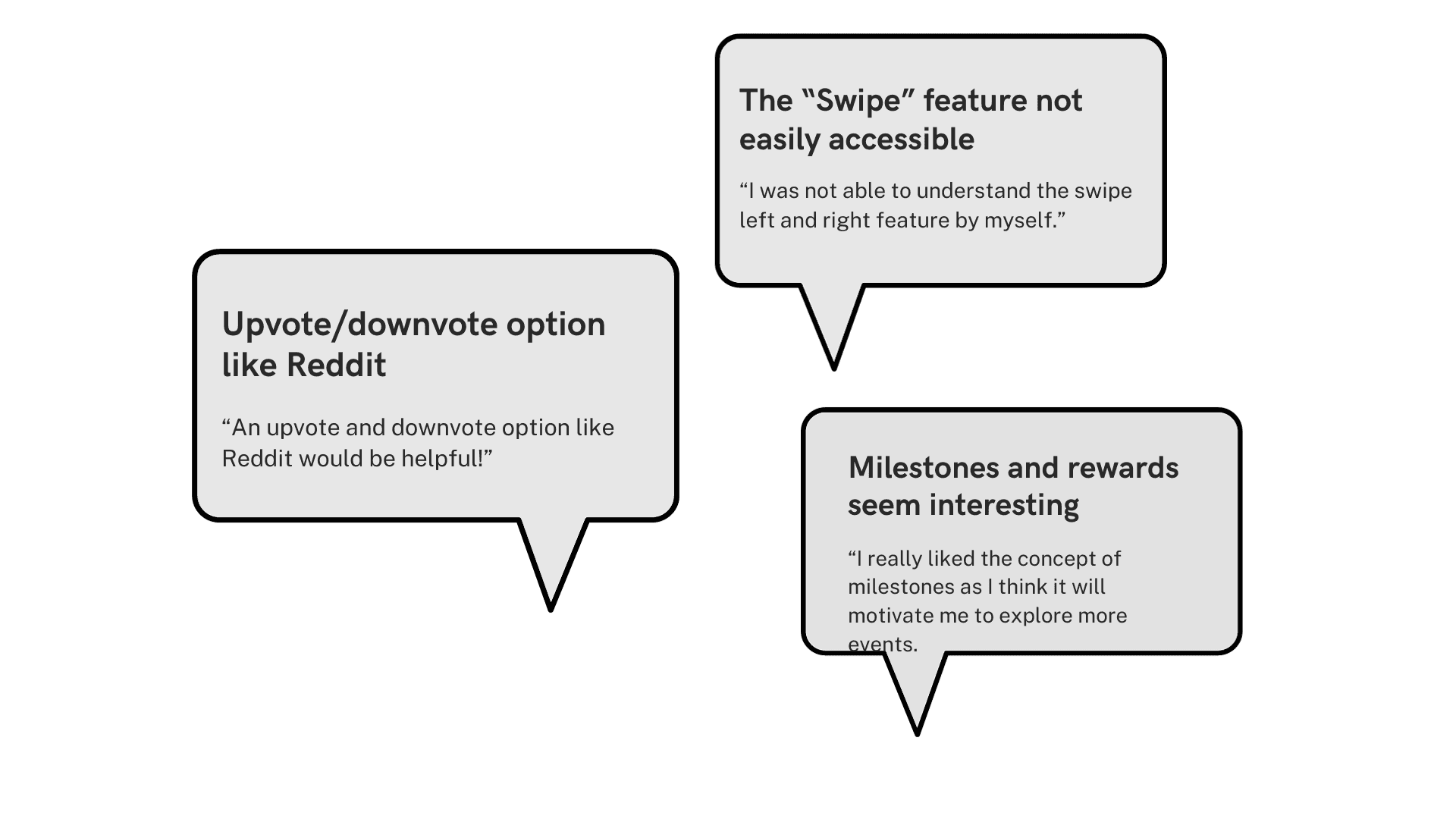
Stage 1 - Initial feedback
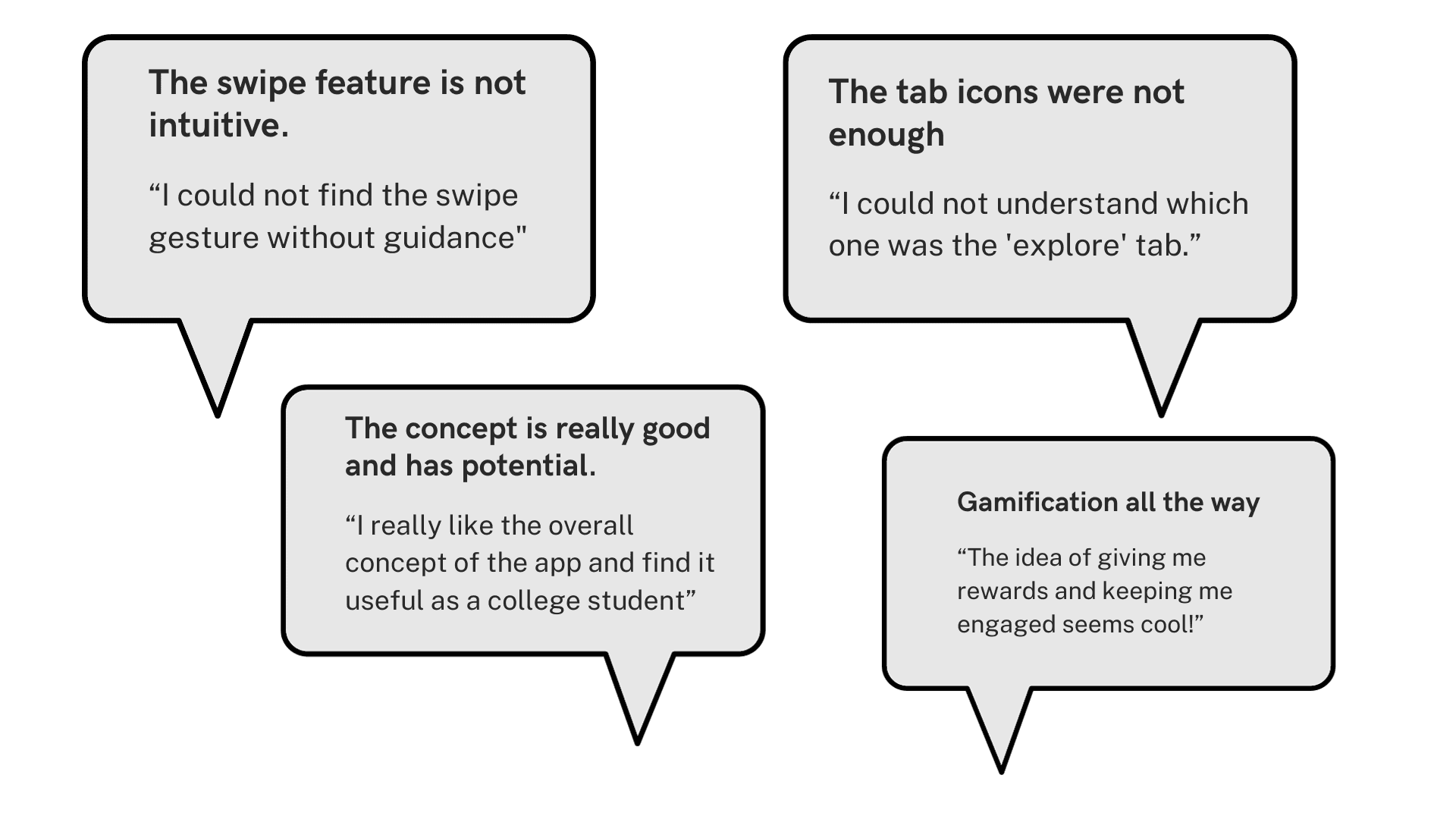
The interactions were not intuitive
Option to upvote/downvote events
Like the milestones and rewards
Stage 2 - Iterative improvements
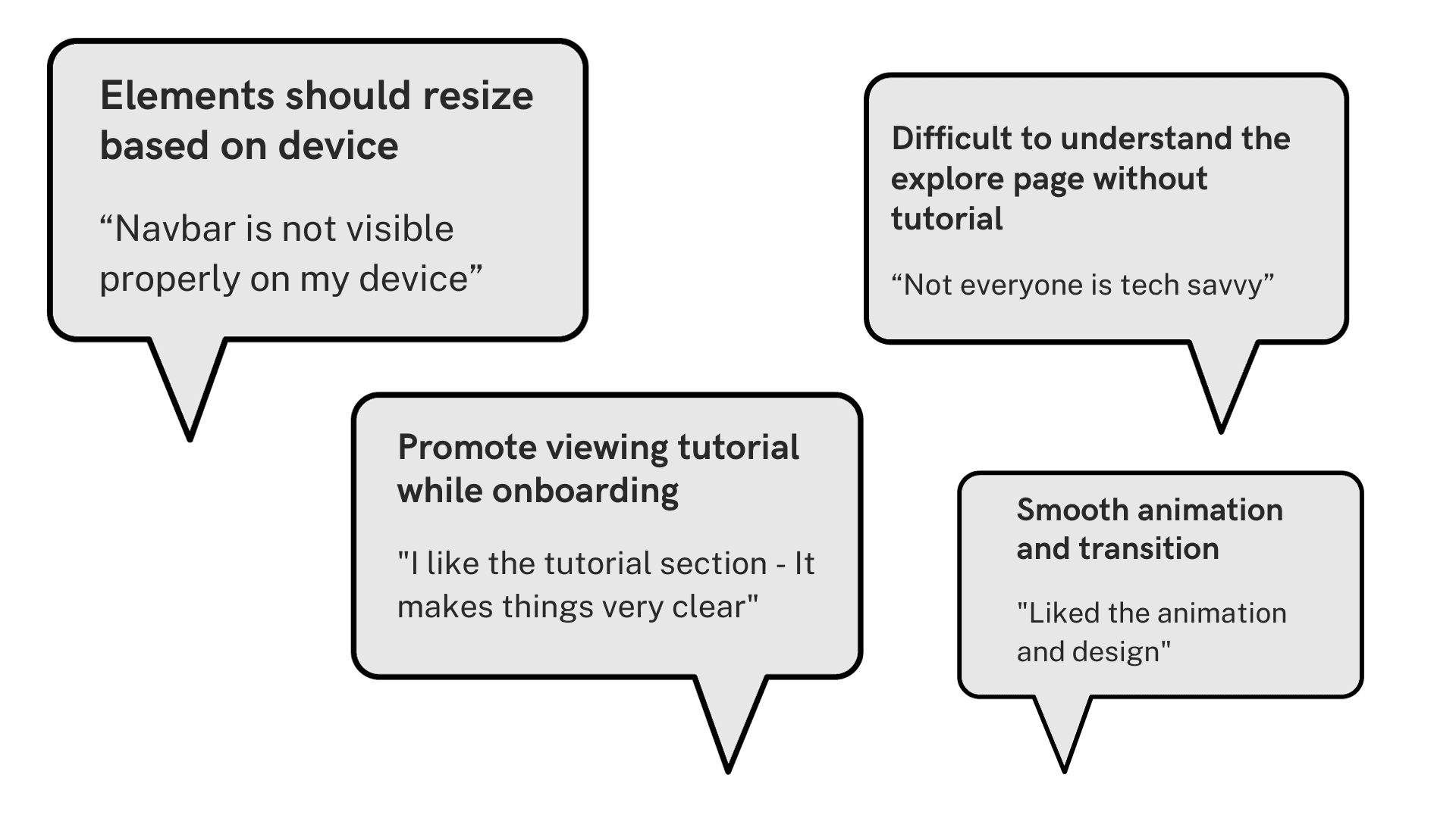
The designs were not responsive
A tutorial on navigating through the app would really help
Users liked the smooth transitions in the interactions
Stage 3 - Enhancing engagement
The tab icons need a description/name
Gamification was a great way to engage users and was a popular choice
The reviews of the users varied according to age group
At each stage, testing the prototype helped the team gain important insights about the issues and gave a direction to fix them and enhance the experience of using the application.
Final prototype
Presented the final prototype incorporating the feedback from users.
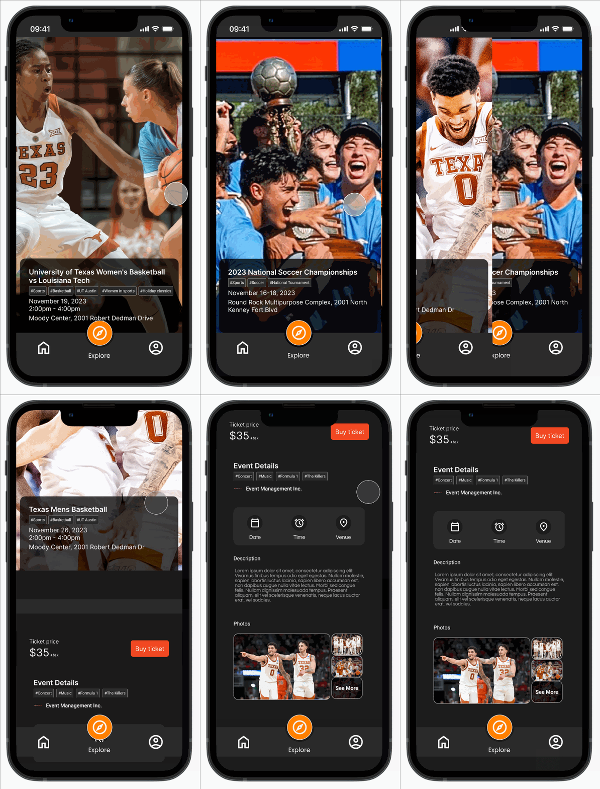
After three rounds of rigorous testing on multiple versions of the app, we designed the final high-fidelity prototype.
The other side of the story
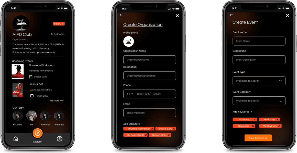
Also designed for organizers who could manage events through same app.
There is no single platform for organizers to post and manage their events. Hence, an organizer side to the app was designed which would make it a single platform to discover and manage events!
Impact
Conducted user testing with 20 users at 3 different stages of the prototype, improving in each iteration.
Improved user engagement from an average rating of 6.4 to 8.8 out of 10, with the minimum and maximum in the final round of testing being 7.5 and 10.
Learnings and outcomes
Testing designs deepens understanding of the user
Through the project, the team learned the different perspectives of users and how it is not enough to think as a designer.Iterative design enhances user satisfaction
The iterative process of testing enhanced the designs and helped the team understand the user requirements and modify the app accordingly.
Adapt and find the optimal solution
Reaching out to organizers was more difficult than expected and the organizer’s perspective of the process was difficult to understand without any inputs.
To summarize
Enhanced the event discovery process, following an iterative process to design an app with 8.8/10 user satisfaction rating.
In order to fix the event management in and around campus, the team designed an interactive application for users to swipe through events to find their match. The team followed an iterative process to test the prototype thrice and improve based on the reviews, increasing the user engagement rating to 8.8/10.
